Monday, October 29, 2007

i wish i could fly too.

so this was a rapid-fire, priority-zero, slap-dash piece, i won't even lie. i did it in twelve minutes at like 1am, sliding in to beat the clock and finish up before rounds on halloween duty. awesome. it's about a bird-child of some sort, seeking a smooth white rock, and my word was "bathe". he wears a red t-shirt also. whatever. i sort of like the process of doing these, sloppy acrylic and brush ink to tighten it up... even if this is not necessarily a shining example of the merits of this technique. god knows i prefer it to the fucking pen tool in photoshop for digital color. blegh.

i have yet to scan the massive map. almost, then change of plans. perhaps, then more immediately pressing concerns present themselves. there's been a lot of that lately. bear with me.

Saturday, October 27, 2007

it's "malcolm in the middle" meets "x-men evolution".

so i know it's been quite some time since i've shown my face in this joint, for which i express my most sincere apologies. it just so happens that fall break, in conjunction with a couple longer-term assignments has stretched out the availability of final products for me to put on display for your viewing pleasure.

i have here my last on-going sketchbook contribution, a cover design for this book on octopi. my word to include was cyclone, as exhibited by the scared octopus running away from a water-tornado of some kind.

in other news, i am attempting to scan my bad-ass (translation: really really big) illustration map from last week's concepts class. once i do that, it will be uploaded, but a few things have come up and pushed that to the back-burner for now. also keep your eyes peeled for the first of my character design for my tv show pitch, "the not-so-secret diaries of luke merriweather". it's about high school and nerds and magical powers and angst and video diaries. you can barely contain your excitement, i can just tell.

Tuesday, October 9, 2007

the sears side.

the final for my roller girl poster came out pretty okay, i think. i am slightly full of rage about how i managed to mis-proportion her shoulders as i did, but other than that, i am pretty pleased with this one. it went over well enough in crit, as a welcome change to the zombie-fighting, blood-spewing, spine-smashing alternatives that littered the wall. it made me feel sort of lame, to be all, "awww, whimsy and childhood and preciousness abound!" but whatever, i am not the one you call when you want blood and gore. it was a pretty successful venture in digital work, but i've concluded that minus the time constraint, i would have preferred to do this piece traditionally.

i discovered, while working on the previous post's piece, that my inking is much stronger when i loosen up and care less, like on, for instance, these continuing narrative sketchbooks we've been doing. if you compare the inking of my initial roller girl character designs to that book and to this final, the differences are startling, with, sadly enough, the ultimately unimportant book spread taking the throne as most successful, with this final clipping at its heels, and the sad, sad rollergirl from last week barely limping across the finish line. i tried to approach this one with the same vigor and momentum as the sketchbooks. my plan is to try and revisit my "default technique" of acrylic and brush ink to see if i can't better control my hand with ink. i'd also still like to better expand the language of my characterization to include more stretched out (read: normally proportioned) figures in the context of the squatty folk, so, tall people can actually be tall instead of just marginally less squatty than their present company. i'm working on it.

also (sorry to be so text-laden today), i am not a slacker and have been working on my "everything happens for a reason" map in concepts which is why i have nothing to show this week for that class, since the final's not due until after fall break, which is really just a four-day weekend. it's going to likely be large, like 22x30, so we'll see if i can manage to scan the beastly finish to upload on here. also, i will maybe--and this is a really big maybe--be posting my screenprint final for fibers and my writing samples for creative non-fiction on here soon. ish. maybe. we'll see. i love love love my non-fiction class. right now i'm writing about harriet the spy. amazing.

Saturday, October 6, 2007

i spent too much time on this and not enough time on the dishes. meaning none was spent on the latter.

here's my latest contribution to the sketchbook swapping exercise in concepts. the previous page showed a drowning kitty swimming after a bat? and my word to incorporate was "belt". so we have old man finding soggy kitty while looking for belt to hold up saggy pants. he's got coke bottle glasses and super-squinty eyes, to better emphasize his lack of sights and explain how, while looking for his belt amongst the swamp he apparently de-belted in earlier that day, he might stumble upon a drowning cat instead. i always hated that whole, "grab 'em by the scruff of the neck" thing, even though it supposedly doesn't hurt. it seems to me like the feline version of a half-nelson, how can that possibly be a "sure, no problem, dangle me in the air for an indeterminate amount of time as my skin gets all smeared out of place and pulls my limbs in funny directions" sort of experience? whatever. i am really loving this ongoing assignment, which i'm pretty sure i said already. point is yesterday was supposed to be "crank out the hero book assignment and sketch and ink my rollergirl final" day, and instead it was "muse and dawdle over an excessively involved hero book then not so much finish the rollergirl sketch" day. what's prioritizing?

Thursday, October 4, 2007

arthur was supposed to be an aardvark too? bullshit.

i forgot we did these animal mascot sketches for the zoo this week too. we were assigned aardvarks, anteaters, or sloths, and had to make them appealing and one (in my case, the bottom one) had to fit the side of a bus. imagine wheels beneath his belly and tail. cute, simple. brian said he liked that is wasn't a straightforward cartoon anthropomorphic animal like a lot of the others. way to go me? i also learned that things look cuter, more innocent, and way less creepy with no mouth. who would've guessed?


Wednesday, October 3, 2007

i am not a sexy vampire robot from outer space.

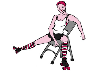
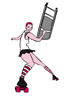
so this week in character development marked the first half of a two-week assignment involving roller girls. we had a model, julia, who was actually a roller girl in the charm city roller derby, come in last week. the first part of the assignment was to characterize her in a resting and an action pose, to be used in a larger , fully rendered poster design (due next week). we had to keep it grounded as the specific roller girl who modeled for us (her derby name? "essie ecks". get it, get it?) , and communicate the essence of her. i was trying some things with total simplification of shape, line, and palette (since i'm usually such a fan of detail and
clutter), as well as digital coloring. also, i decided she was going to be ready to hit you in the face with a folding chair, and i planned to move forward with a final poster design of the badass roller girl in a rink of tiny little girls skating around joyously (hence the pink).

my crit proved to be a little frustrating when, taken out of context, my characterization of essie appears boring and starightforward, expecially compared to other student work that featured "essie the slutty amazonian goddess" , "essie as tank girl", or a sweet "essie the communist". simple looks like crap pinned next to the hyper-detail-oriented. anyway, so i was getting sort of frustrated at the notion that every character design in that class had to be insane and ridiculous (see above, re: title), because i really hoped to be able to use that class to inform my work (which is not at all flashy armor and explosions) and render subtle differences in body type and facial expression as a means of differentiation. of course you can tell that a brute is a brute when he is four times the height of the other characters and he has four arms whose biceps are as big around as the other characters' waists. i wanted to learn to communicate those differences without screaming them at the top of my lungs. and i also didn't want to abandon the goals i had or the work i wanted to be making to make a less successful version of what everyone else was doing, because i was catering to what i thought brian wanted to see. so i explained to him that i thought i would die a slow, painful, character development-related death if i did such a thing, and he was really understanding, and when i spoke to him toward the end of class about my sketches, he seemed jazzed about my final poster concept, even if it didn't feature zombie warriors riding giant porpoises that breathe green smoke. this week's legitimately mediocre work notwithstanding, i hope that i can prove i don't suck during the course of the rest of this class, and also not accept defeat and draw the fantasies of twelve year-old boys.
*NOTE: all superlative character ideas were actually, seriously, discussed during crit yesterday.

Tuesday, October 2, 2007

because cover bands are just tacky.

when rebecca told us we would be doing actual concert posters for the 8x10 club here in baltimore, i was stoked. kaki king performed there last year, and in my head i was playing out grandiose fantasies of rendering some amazing illustration for an up and coming band that would be loyal to their fledgling artist and when they hit it big, use my work for t-shirts and album art and i would be brilliantly famous and well-paid. and then, we got our bands. dreams shattered, i got "weekapaug orchestra", a (now wait for it...) phish tribute band. i emphasize tribute because i was sharply corrected when i referred to them as a cover band. so to jam band hell i was banished. it was okay, ultimately, i went in a tongue-and-cheek-y direction and made the lovely poster you see here. it was my first real venture into digital coloring, and in print the orange came out a little yellower than it is here which bummed me out a bit, but overall it was a pretty okay experiment, me and photoshop's pen tool are now bffs. it went over well enough in crit, minus any orange-related trauma.